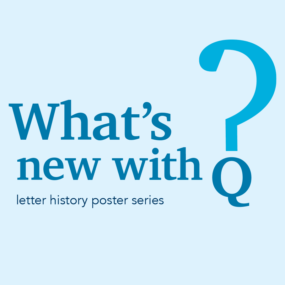
"what's new with q?" letter history poster series
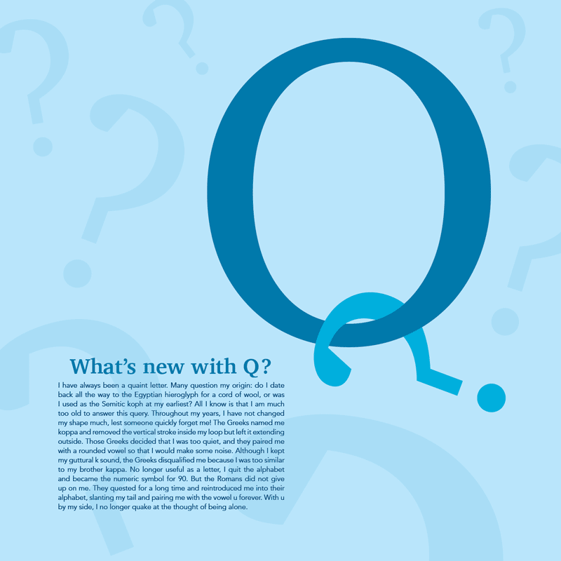
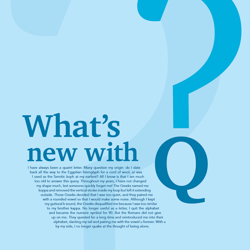
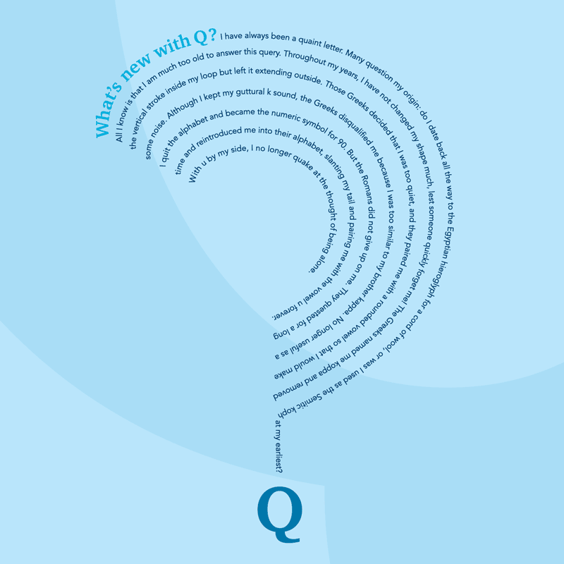
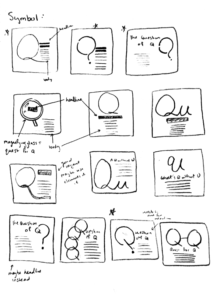
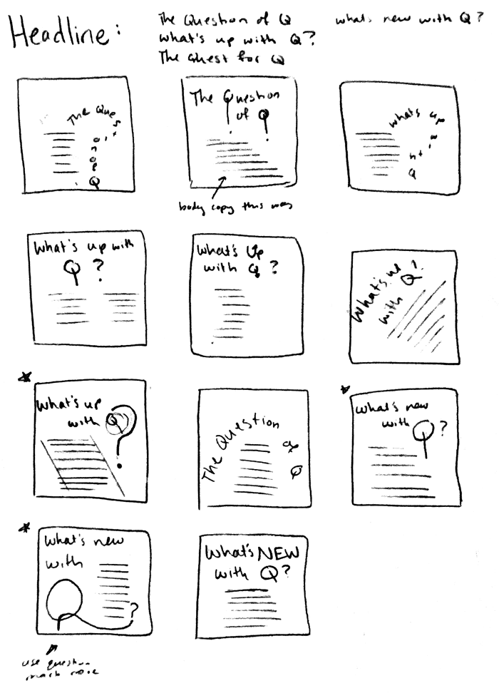
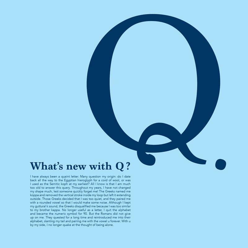
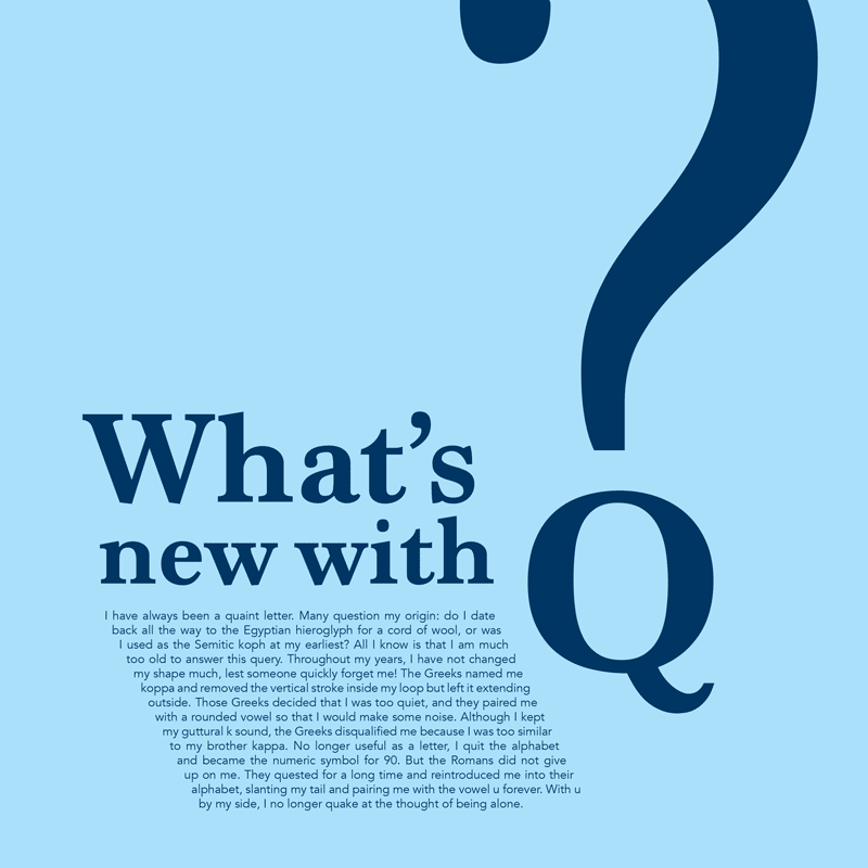
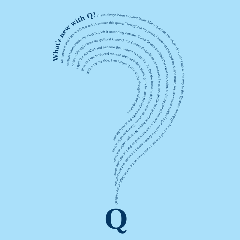
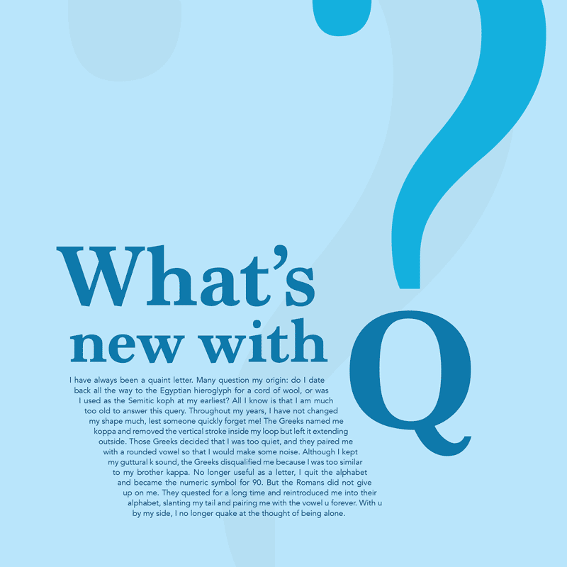
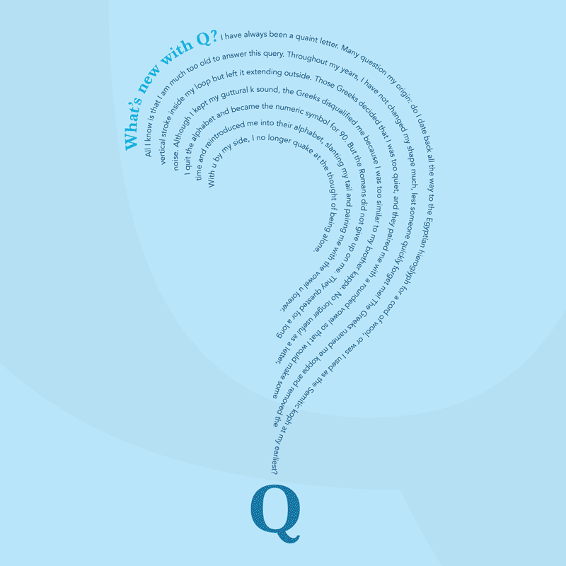
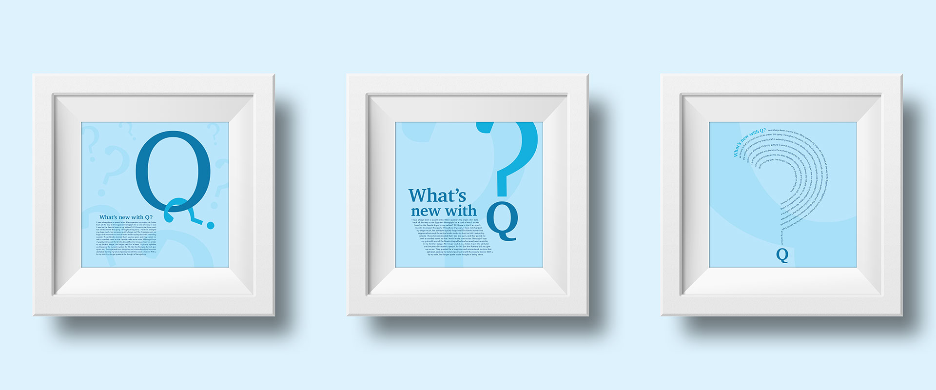
“What’s New with Q?” highlights the history of the letter Q from its origin to its current use in the English alphabet in a series of 10″ × 10″ posters. Each poster’s design focuses on a different visual hierarchy: symbol, headline, and body copy. The posters share the same story about Q’s history, guiding viewers through its beginnings to its current place among the 26 letters. The Q’s gradually slanting tail informs the angled elements in the poster series, and the question marks represent Q’s questioning of its identity. The minimal changes in the Q’s design throughout time reflect its stability and wish not to be forgotten. The paragraph culminates in Q’s pairing with the letter U, never fearing loneliness again.
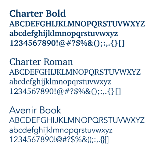
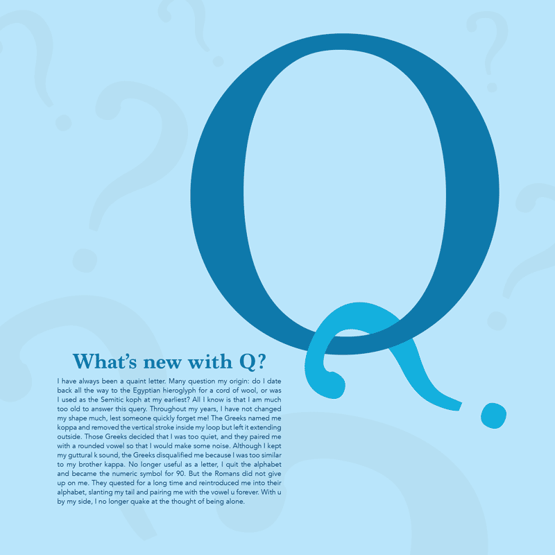
The headline and symbol utilize Charter, a transitional serif typeface that contrasts the body copy’s use of a sans‑serif typeface. The Charter Q styles its tail as a slant that does not protrude through the body, illustrating the Q’s complete change in shape throughout time. The geometric sans serif typeface Avenir Book complements Charter with its large x‑height and wider counters. The geometric style adds a hint of minimalism to the design, which ties in with the monochromatic color palette.
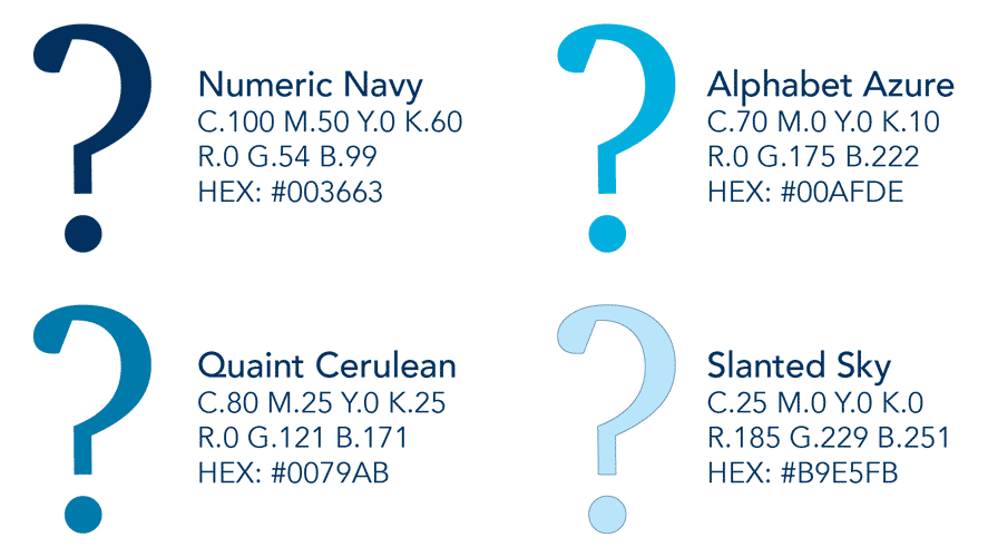
Representing stability, the patient color blue depicts Q’s relatively unchanging letter form, sound, and place in the alphabet throughout history. The ancient letter has stood the test of time, and blue portrays this reliability. The monochromatic color scheme does not distract with varying colors, so the audience can focus on remembering the letter Q and its history.
final poster series
color & type study
