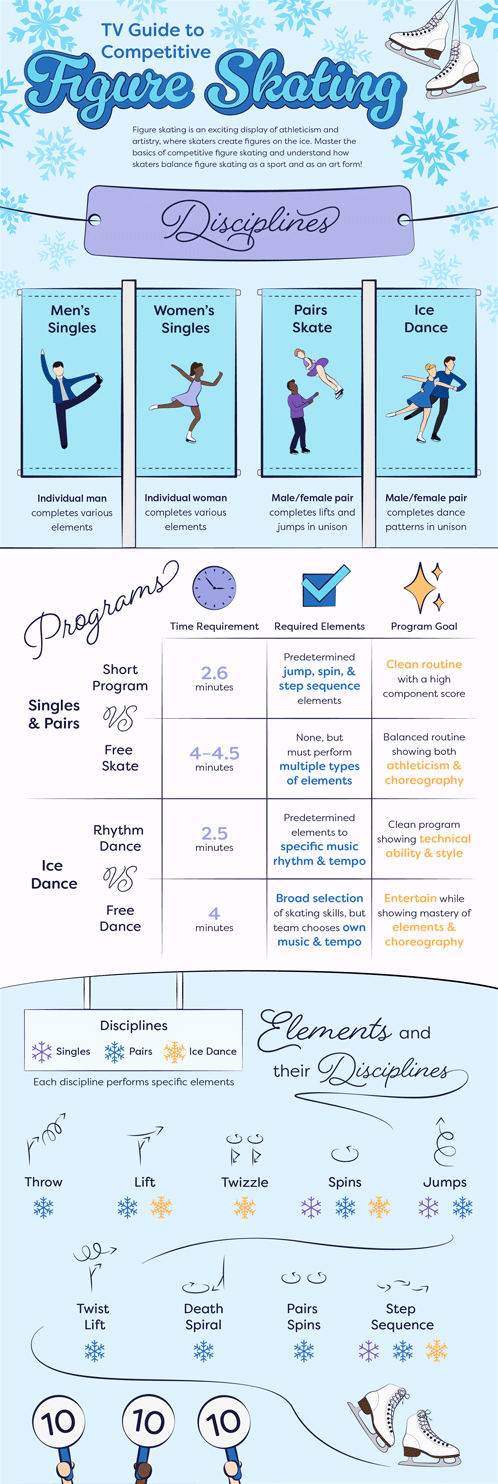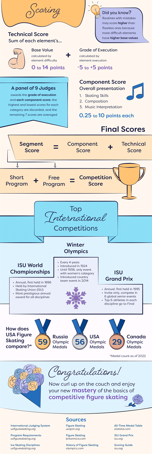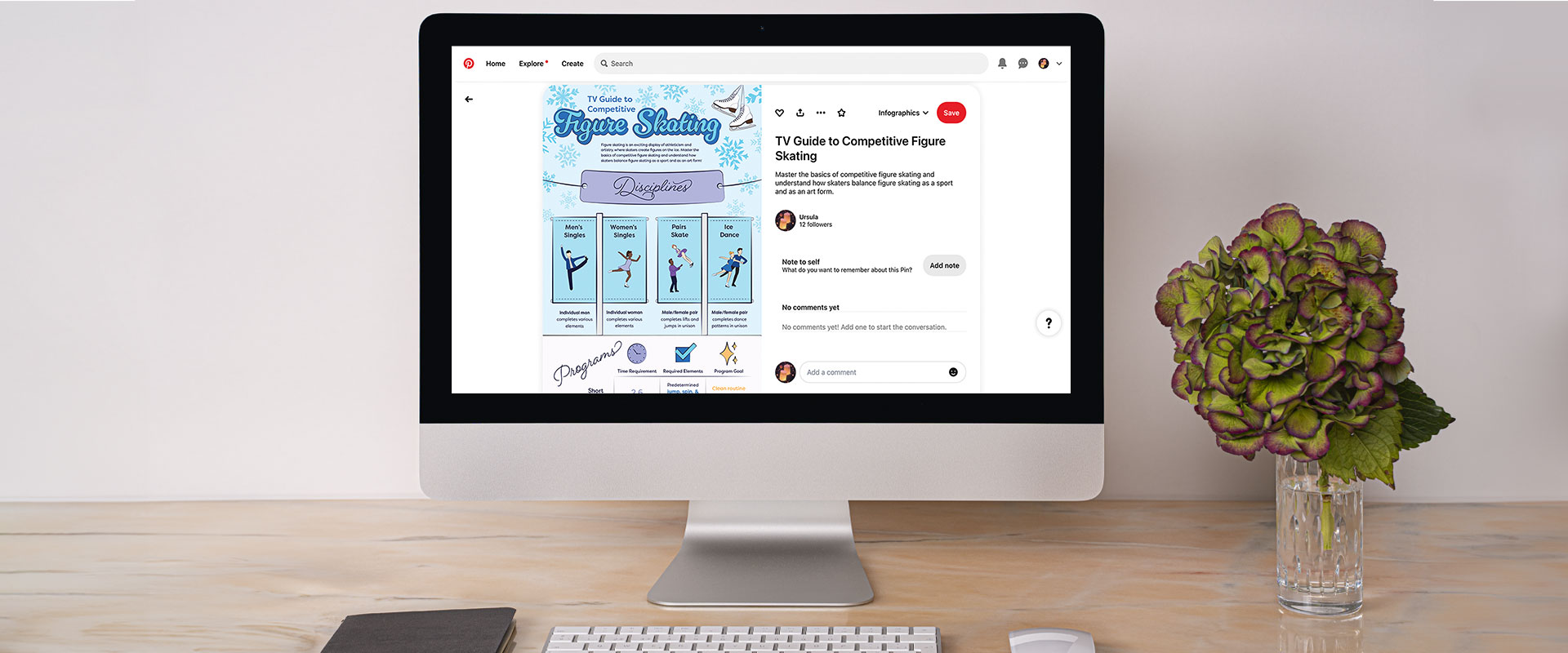
"tv guide to competitive figure skating" infographic

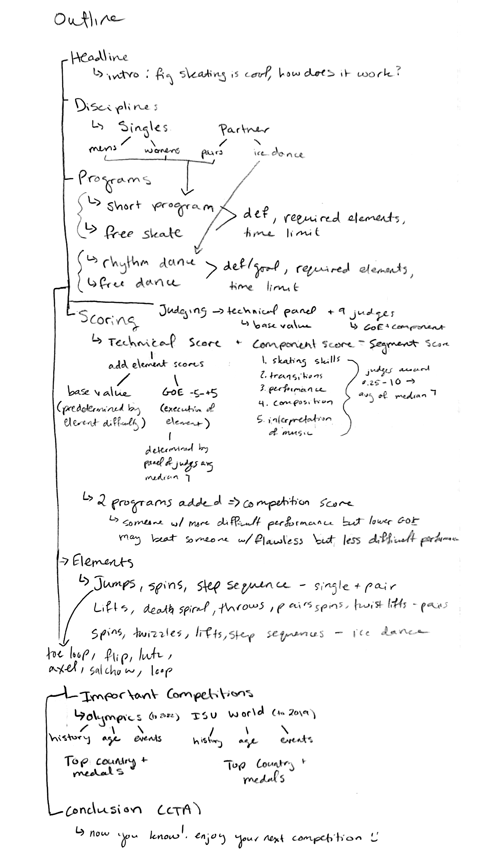
“TV Guide to Competitive Figure Skating” is an infographic designed for Pinterest that teaches audiences the basic information they need to watch a figure skating competition. Research from US Figure Skating, the International Skating Union, and the Olympics formed information related to disciplines, programs, elements, scoring, and the top international competitions.
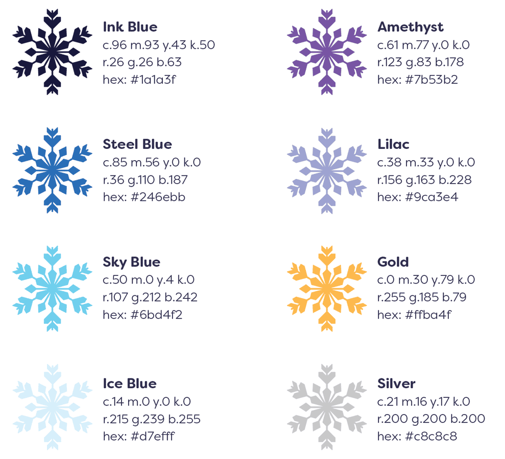
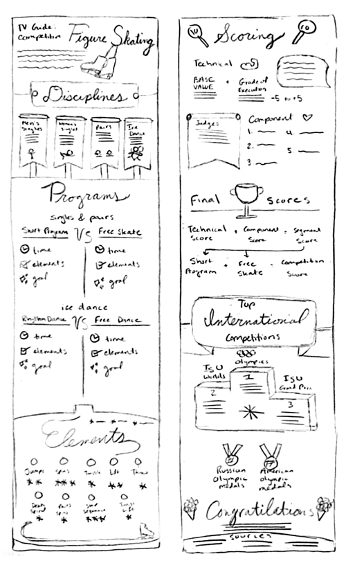
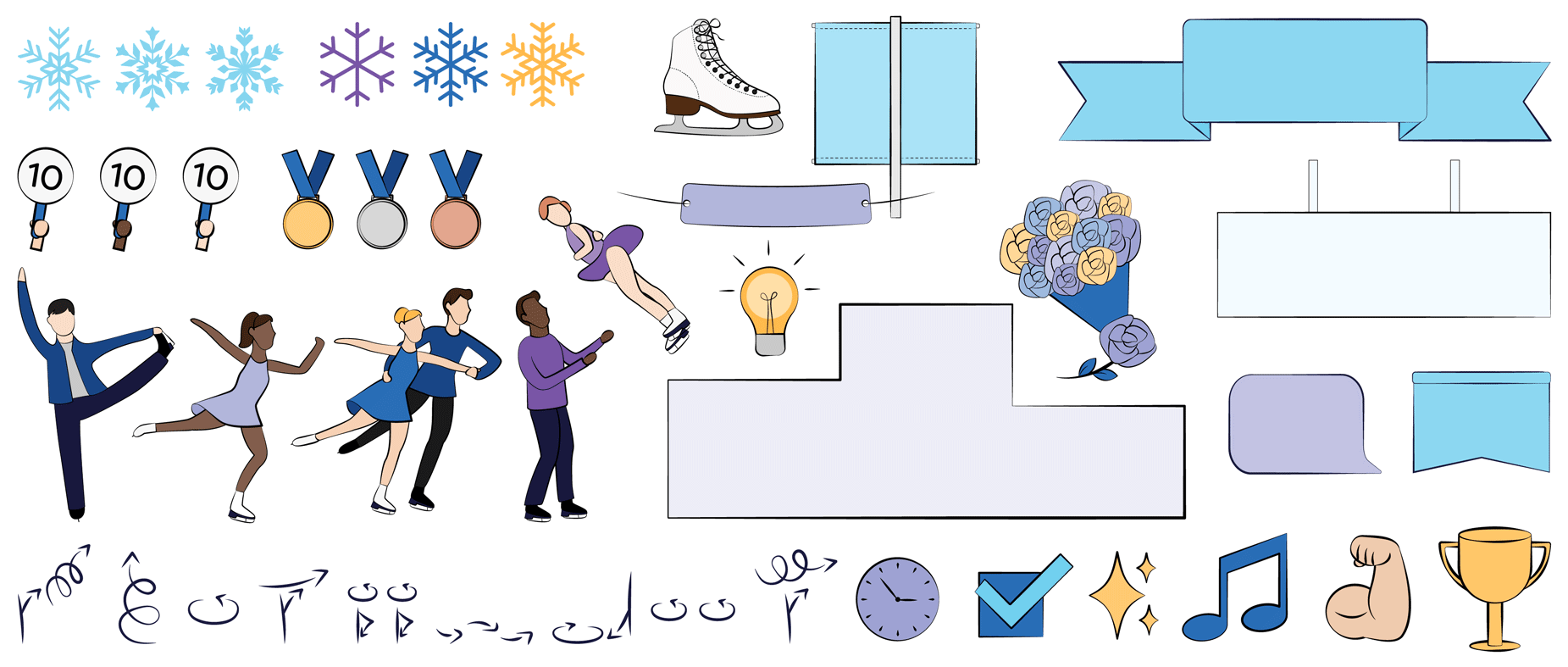
This infographic draws inspiration from retro posters of the 1960s and 70s using hand‑drawn illustrations to evoke nostalgia for this timeless activity. The symbols visually aid the reader in understanding concepts quickly and effectively. The sport’s association with ice informs the cool color palette, and the gold accent color echoes the gold medals that skaters hope to win at the competitions.
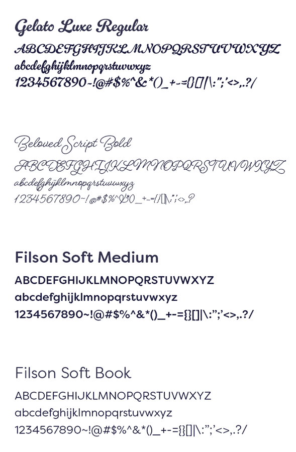
The infographic’s title features the Gelato Luxe Regular typeface for the main title, drawing viewers’ attention with its bold script letters. The poster utilizes the Filson Soft typeface and its multiple weight variations for the body copy and as a secondary title font. This typeface’s large x‑height allows for easy readability, and the rounded letters invite friendliness. The section headlines apply the Beloved Script Bold, a fully customizable typeface with multiple glyphs, because it resembles the elegant figures that skaters make on the ice.
With its vintage and illustrative influences, “TV Guide to Competitive Figure Skating” makes learning the basics of the sport accessible and fun, giving viewers a mastery of the basics to watch the next competition confidently.
final infographic
color & type study
