sweetsify branding & brochure
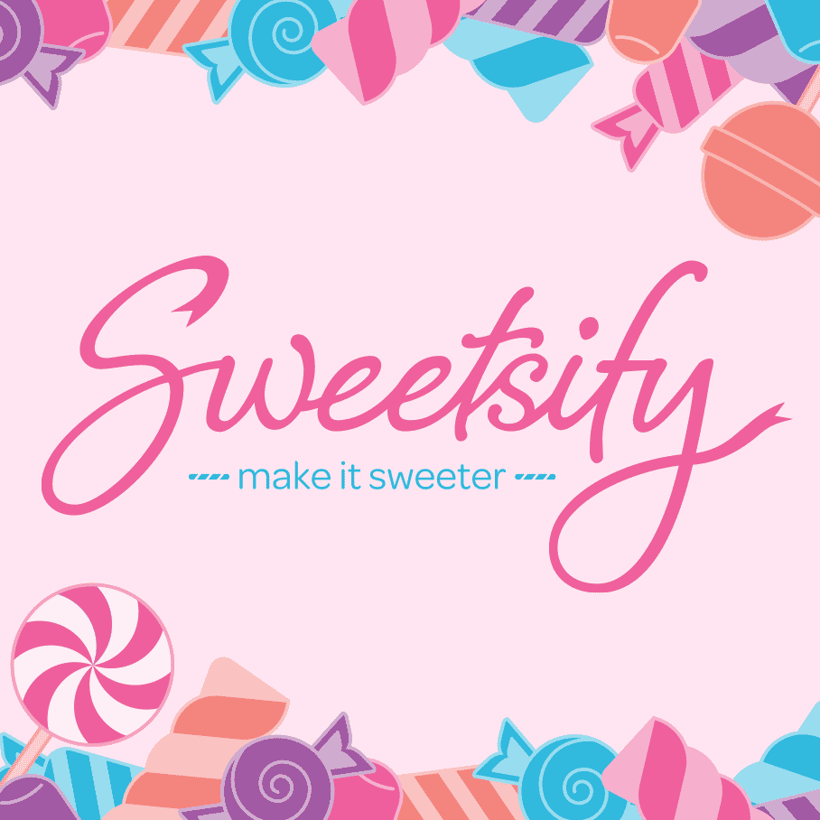
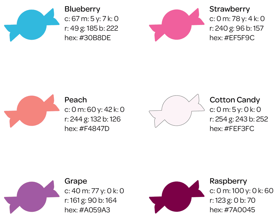
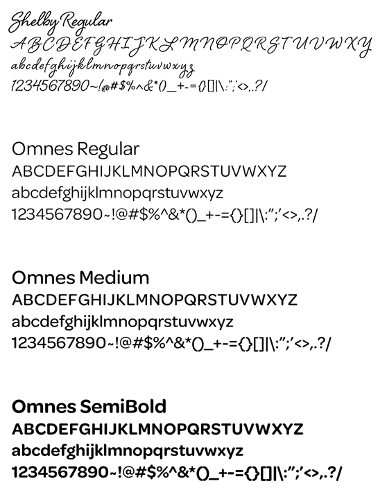
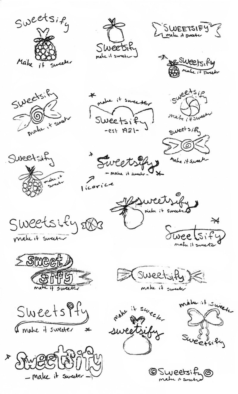
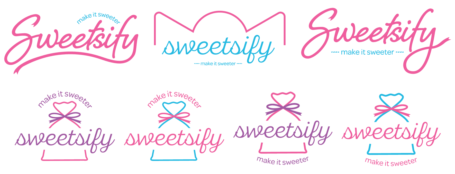
Sweetsify’s logo manipulates the script typeface Shelby Regular to emulate the ribbon used to tie the customer’s candy bags. The rounded sans‑serif font Omnes Regular complements Shelby with its large x‑height and wide counters, making it easy for all to read from a distance. Together, the typefaces create a timeless logo. Sweetsify’s vibrant brand colors remind customers of popular candy flavors they will see in the store: strawberry, blueberry, peach, and grape. The warm and cool colors create a playful and delicious brand.
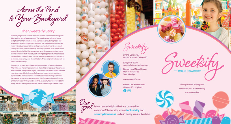
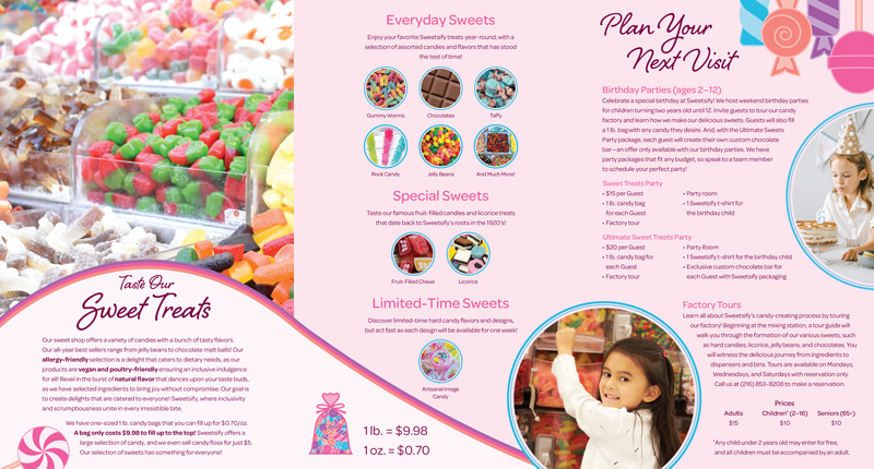
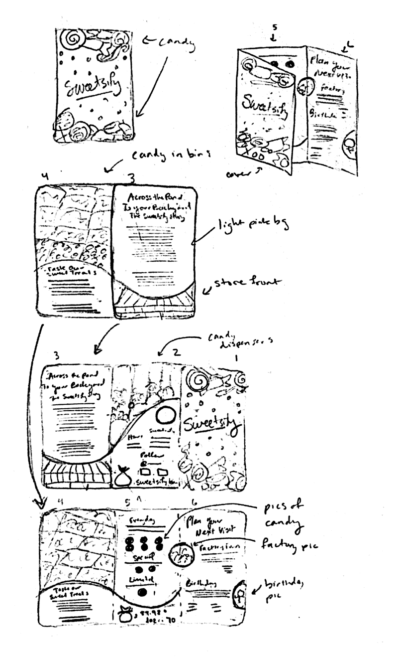
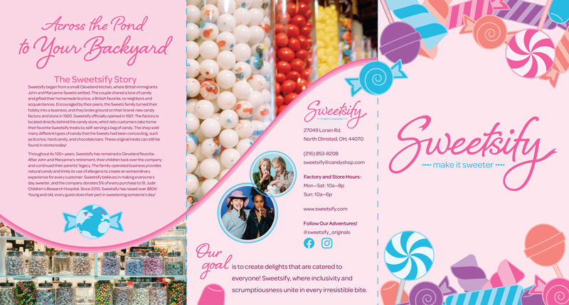
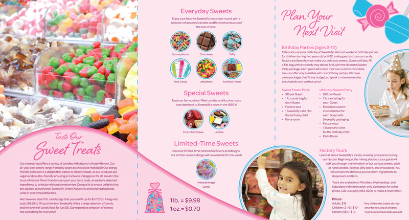
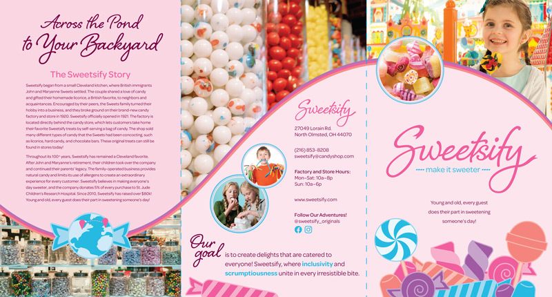
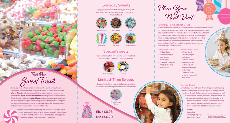
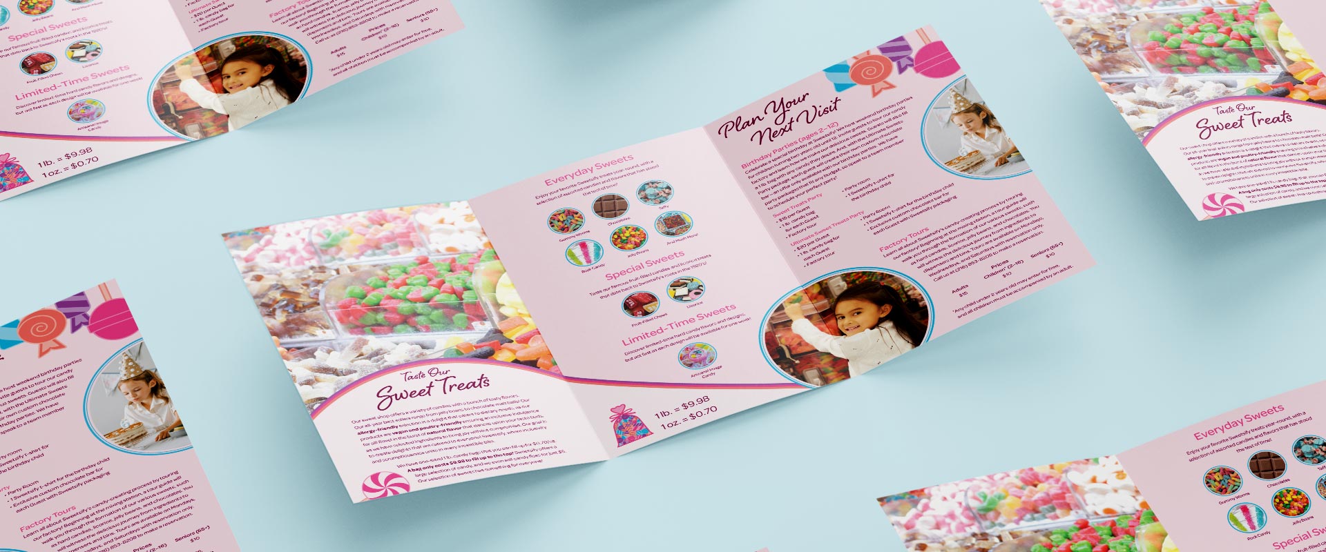
Sweetsify’s 8″ × 5″ folded, 24″ × 5″ flat, tri‑fold brochure informs customers about the company’s history, products, services, and contact information. The brochure incorporates images licensed from Adobe Stock, Pexels, and Unsplash to depict some candy products, the store, and children. Additionally, candy illustrations populate the front cover and various pages throughout the brochure. The candy stripe borders and rounded elements create movement, taking readers on an effortless journey from one panel to the next. With bright colors and big images, this brochure is informative and fun for all readers.
final brochure
brand illustrations
color & type studies
