fairview park puzzlers branding & identity
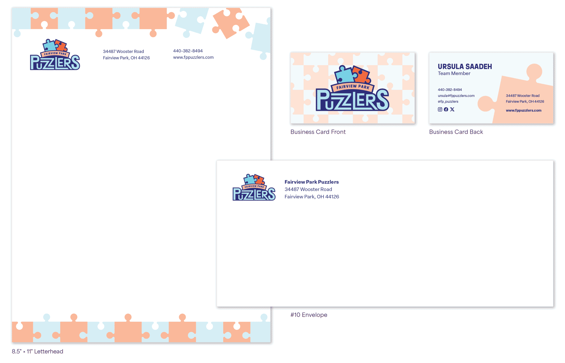
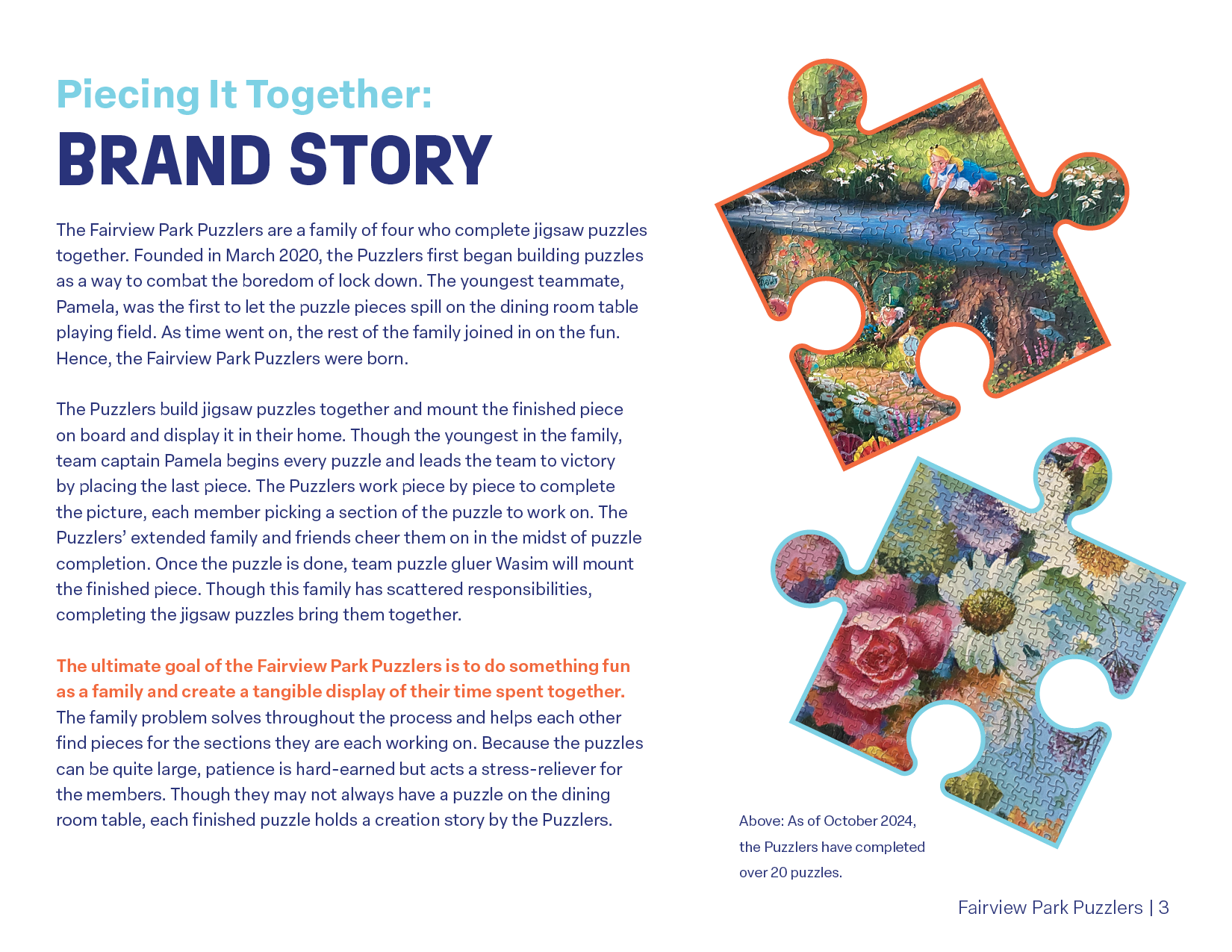
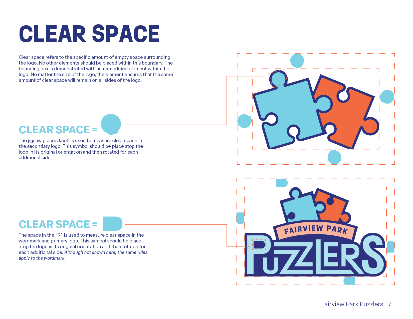
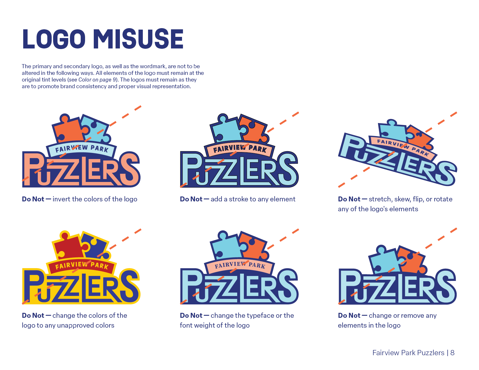
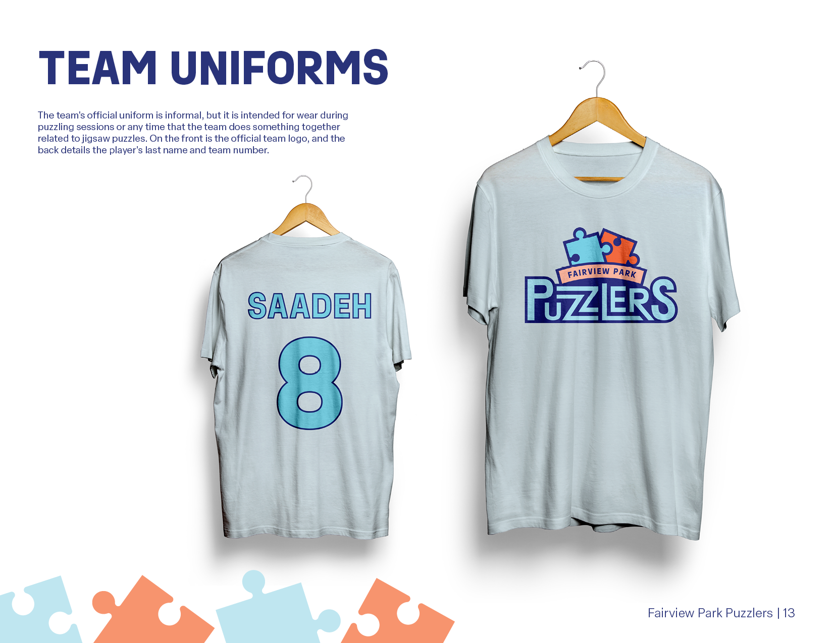
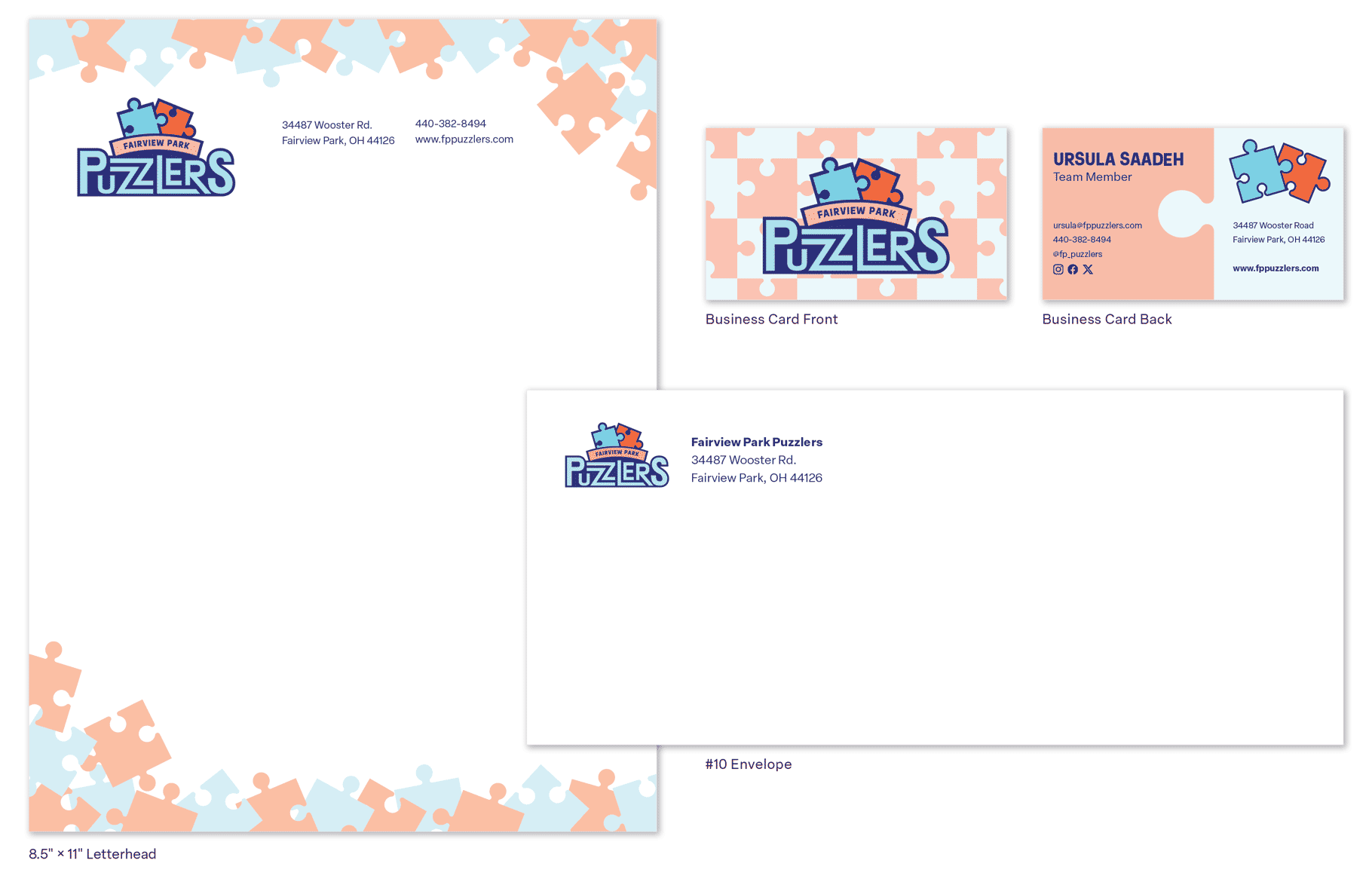
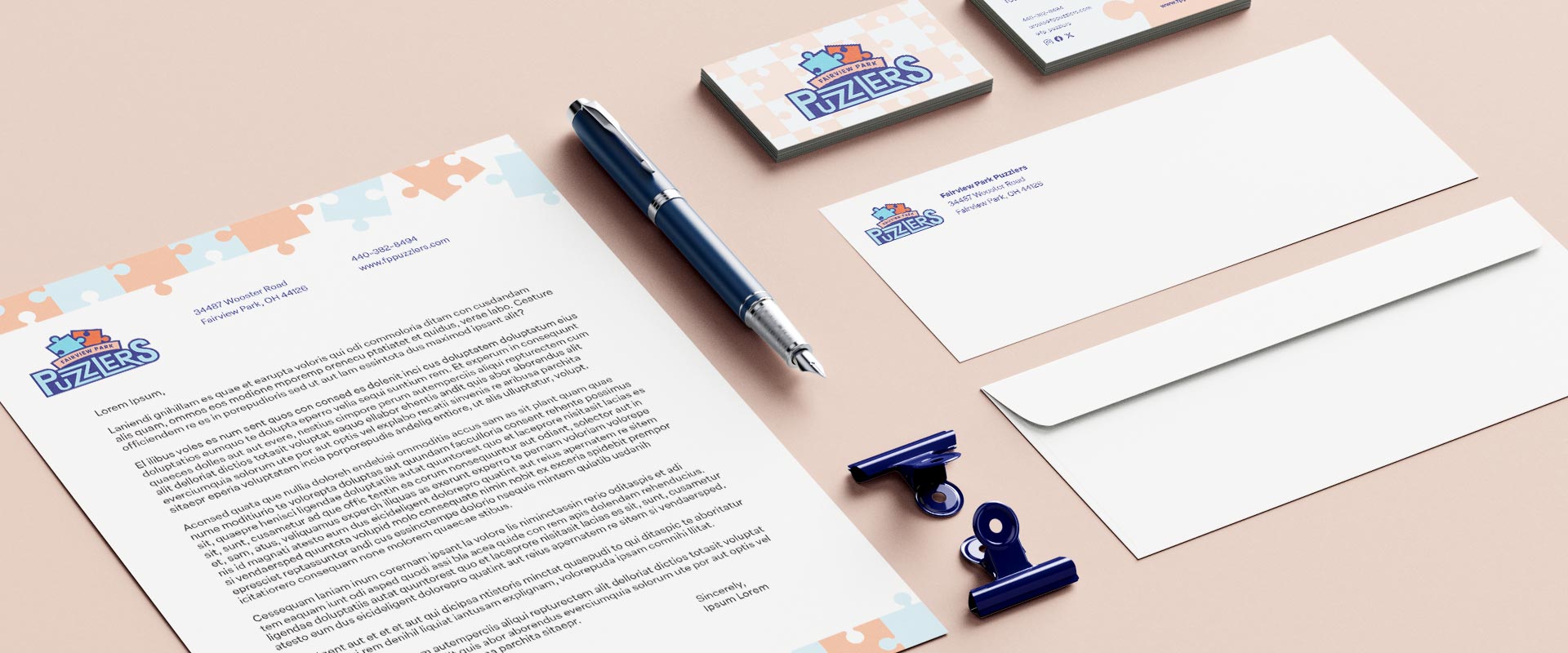
The Fairview Park Puzzlers (FPP) is an informal family sports team that completes jigsaw puzzles together. Founded in March 2020, this family of four began building puzzles to combat the boredom of lockdown. The Puzzlers represent themselves with a dynamic logo that exemplifies the “put it together” essence of the team. The FPP Brand Identity Guidelines describe approved uses of the primary and secondary logos to maintain brand consistency.
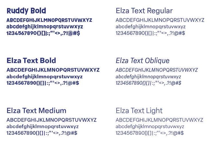
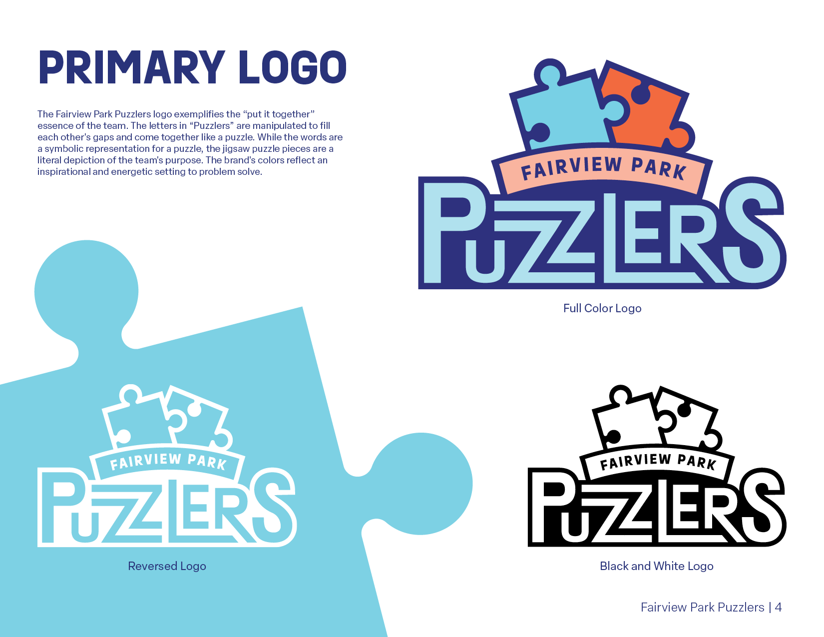
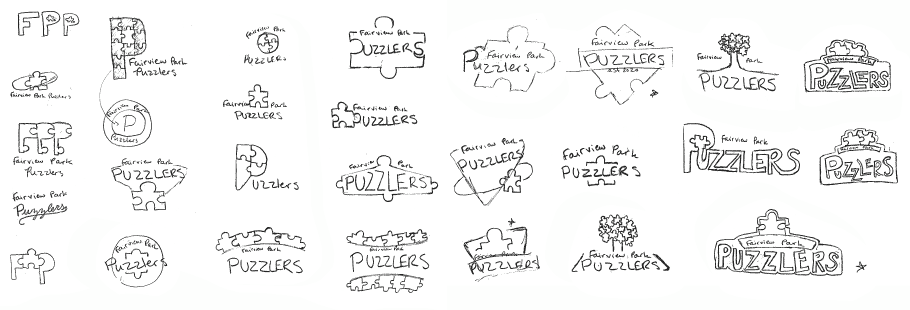
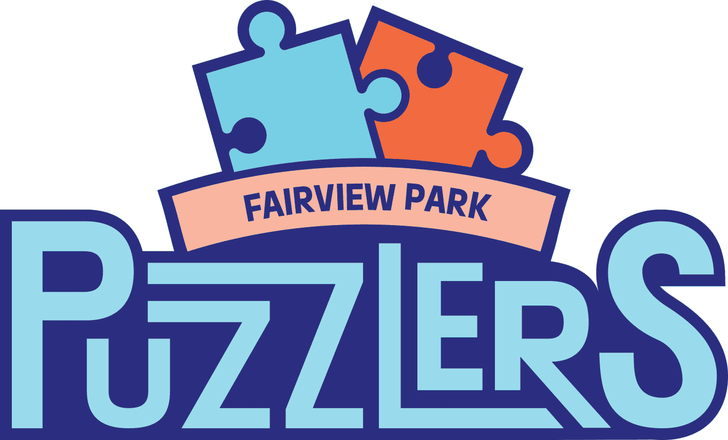
The primary logo manipulates the Ruddy Bold font to create a word mark whose letters come together like a puzzle. The jigsaw puzzle pieces depict the team’s purpose in putting the pieces together. The Puzzlers’ secondary logos provide alternate options for branding when the team does not wish to use the primary logo. The brand guidelines expand the logo’s typography by including the Elza Text typeface and various font weights for additional branding, such as subheadings and body copy.
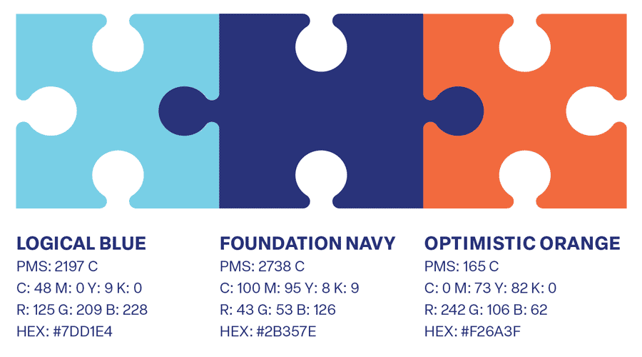
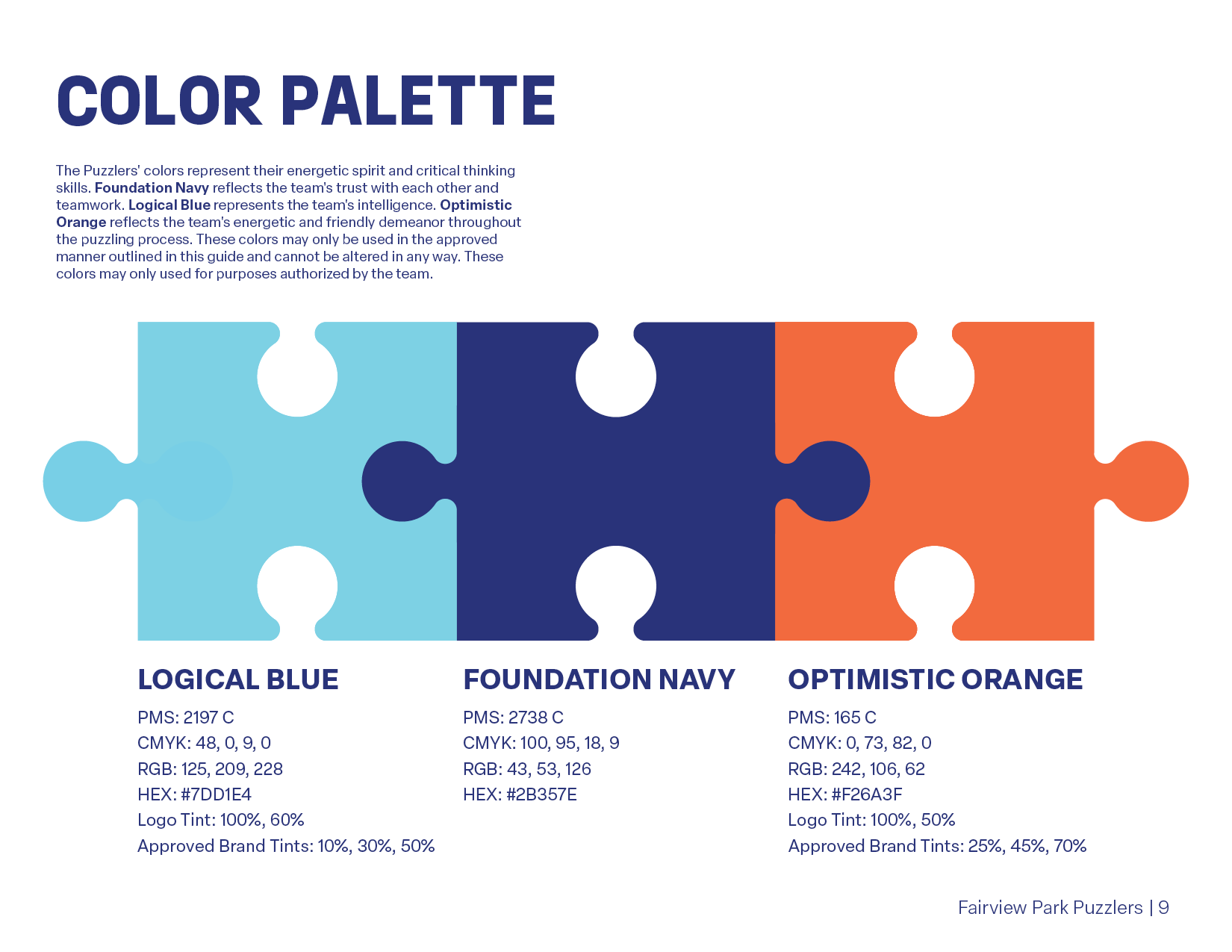
The Puzzlers’ saturated color palette showcases the team’s energetic spirit and critical thinking skills. Foundation Navy reflects the team’s trust in each other and ability to work together. Logical Blue represents the team’s intelligence. Optimistic Orange demonstrates the team’s enthusiasm and friendly demeanor throughout the puzzling process. The logo and branding use various tints of these colors, as outlined in the brand guidelines.
The FPP brand uses jigsaw puzzle pieces, complementary saturated colors, and bold typography in its branding to emphasize their goal of doing something fun as a family and creating a tangible display of their time spent together.
primary and secondary logos
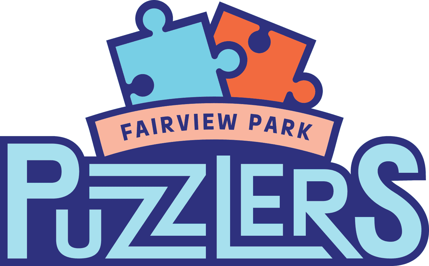
primary logo

symbol

word mark
brand identity system
brand identity guidelines
color & type study
