city pet branding & identity
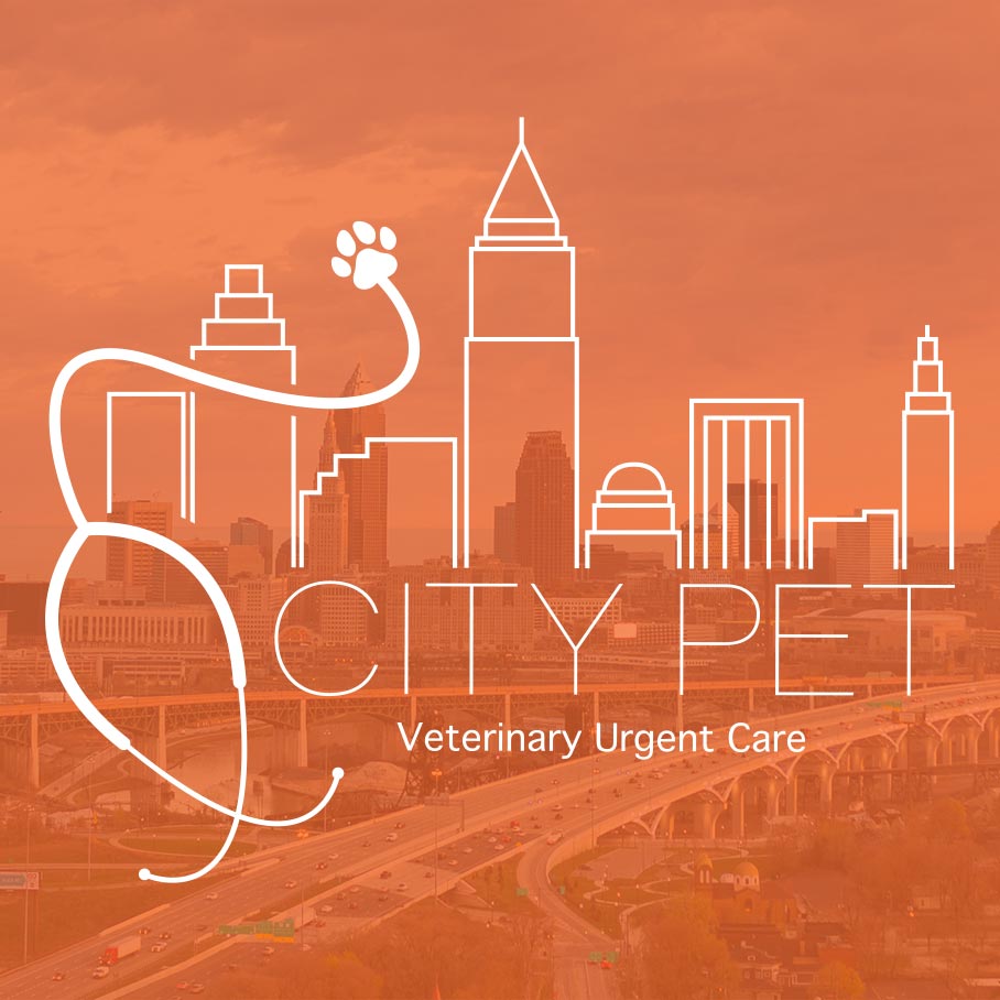
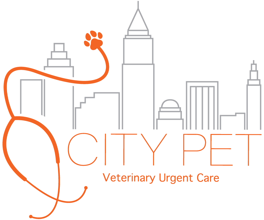
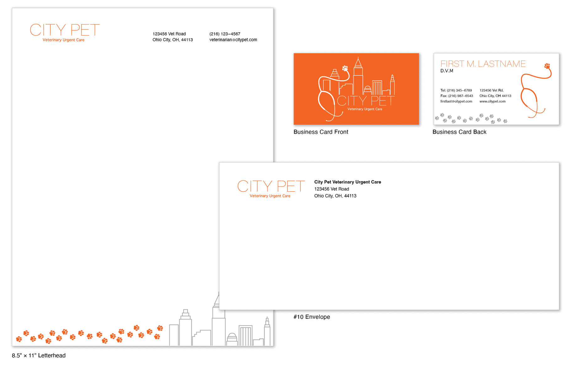
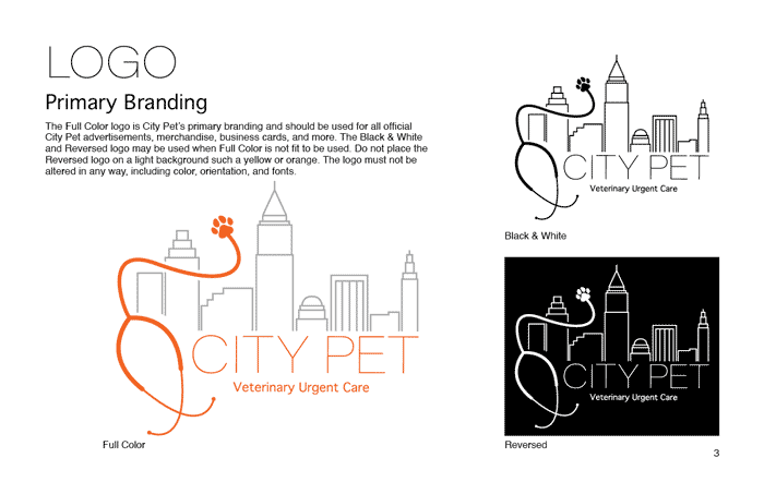
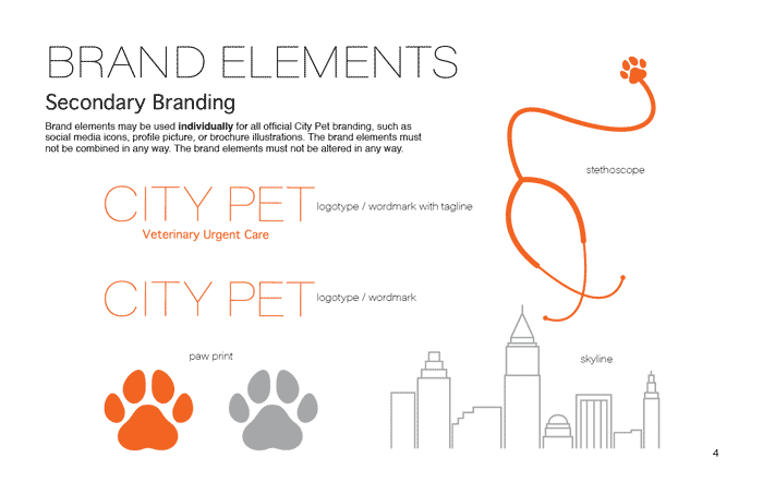
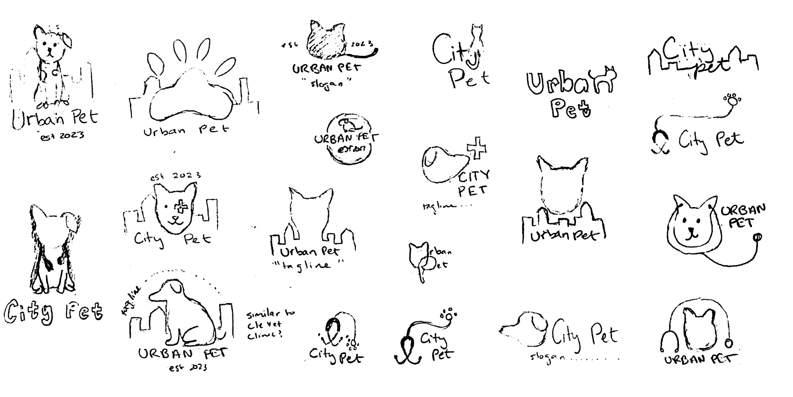
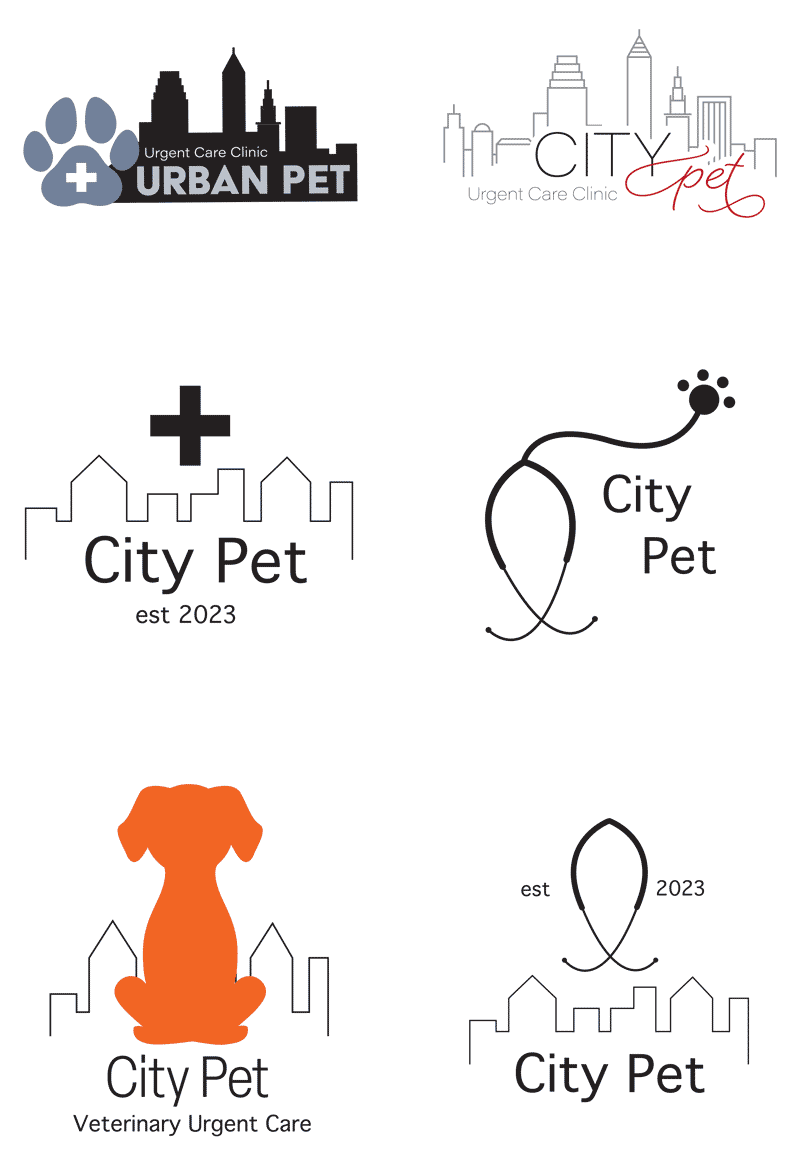
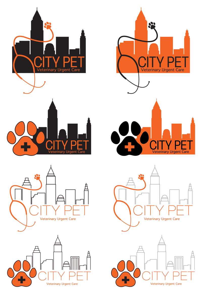
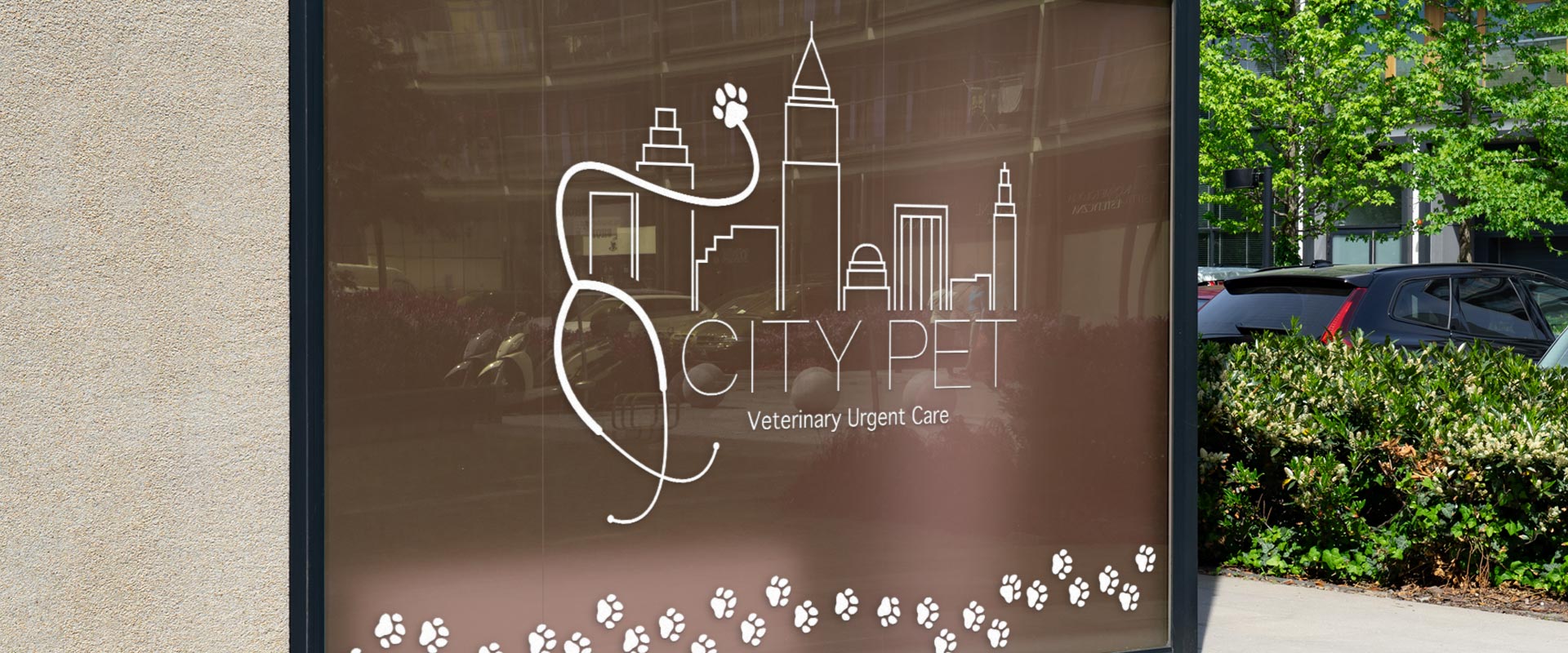
City Pet is an emergency pet clinic in Ohio City. The client requested a clean, simple, and modern design that strayed away from stereotypical animal imagery and hospital colors. Preliminary research of veterinary clinics in the Cleveland area informed a logo design without dogs, cats, and birds. The City Pet logo successfully combines illustrations of the Cleveland skyline, representing the “City,” and a paw print stethoscope, representing the “Pet.”
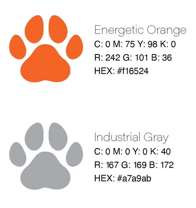
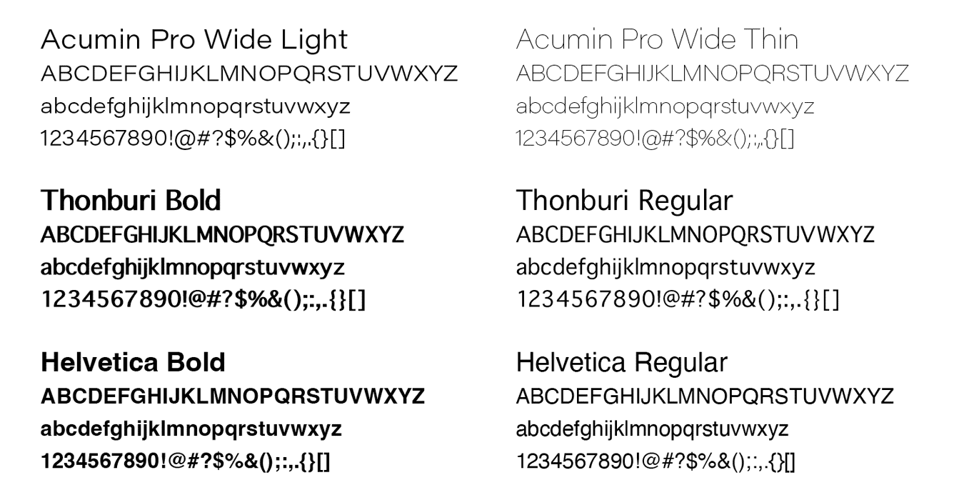
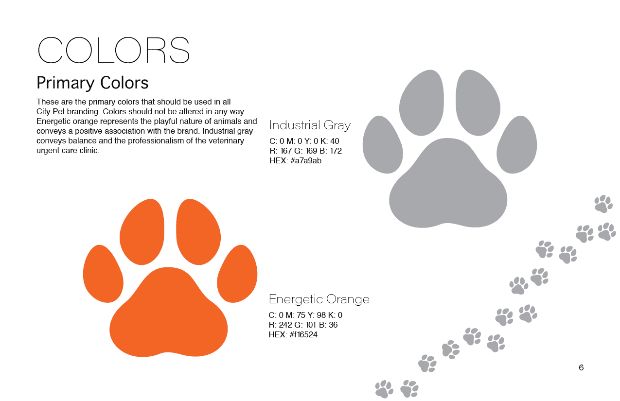
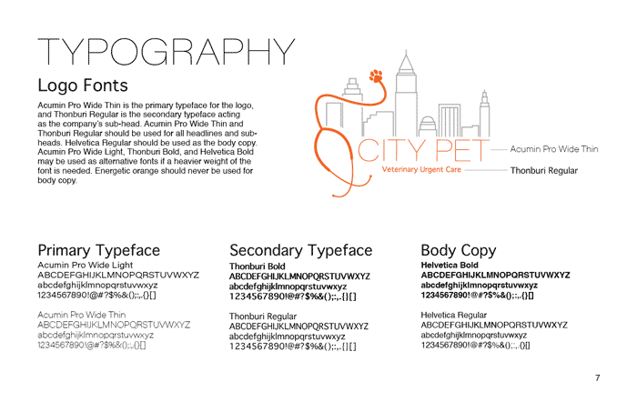
The brand’s orange and gray color palette balances the playful nature of animals and the professionalism of a veterinary urgent care clinic to create a positive association with the brand. The logo utilizes the Acumin Pro typeface to embody the modern and ever‑changing city, while staying grounded with the bold Thonburi typeface tagline. City Pet’s sleek logo and brand elements establish a timeless brand identity that stands out among veterinary service providers in the Greater Cleveland area.
primary & secondary logo
brand identity system
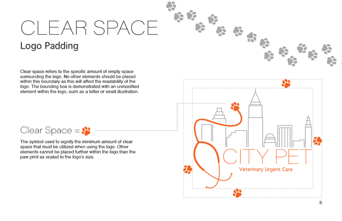
brand identity guidelines
color & type study
