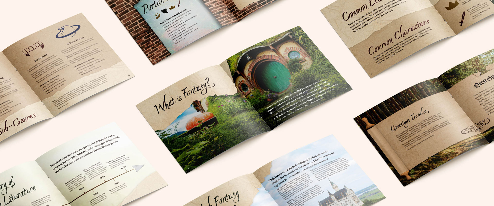
oh my magic brochure
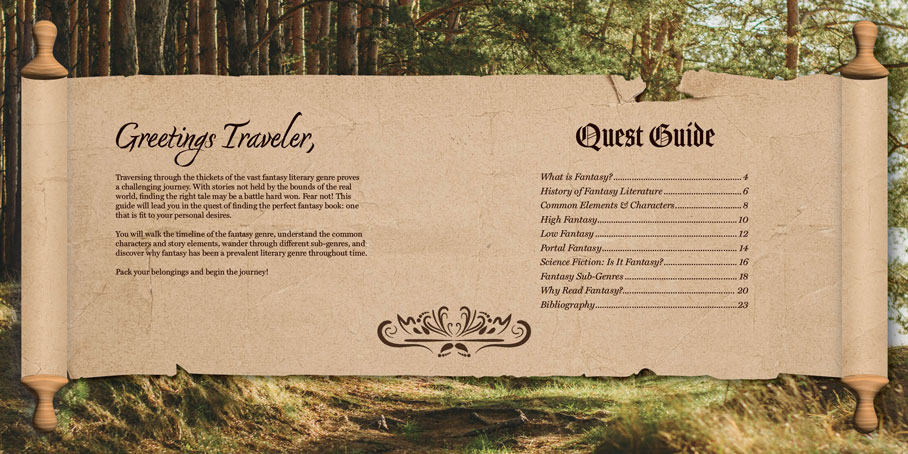
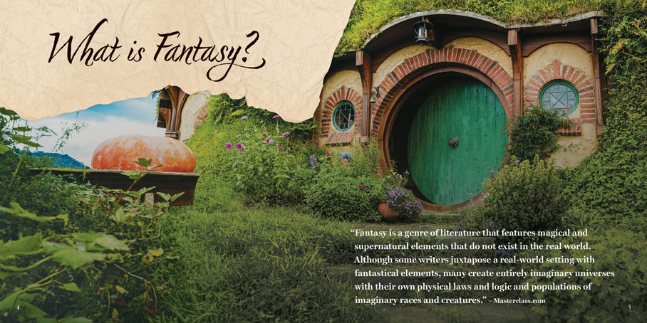
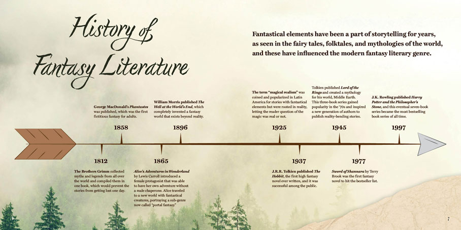
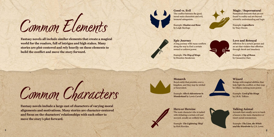
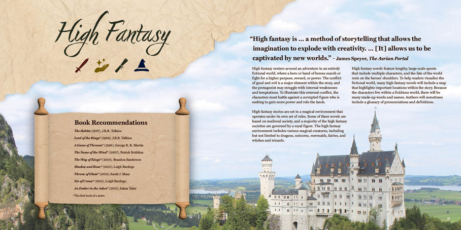
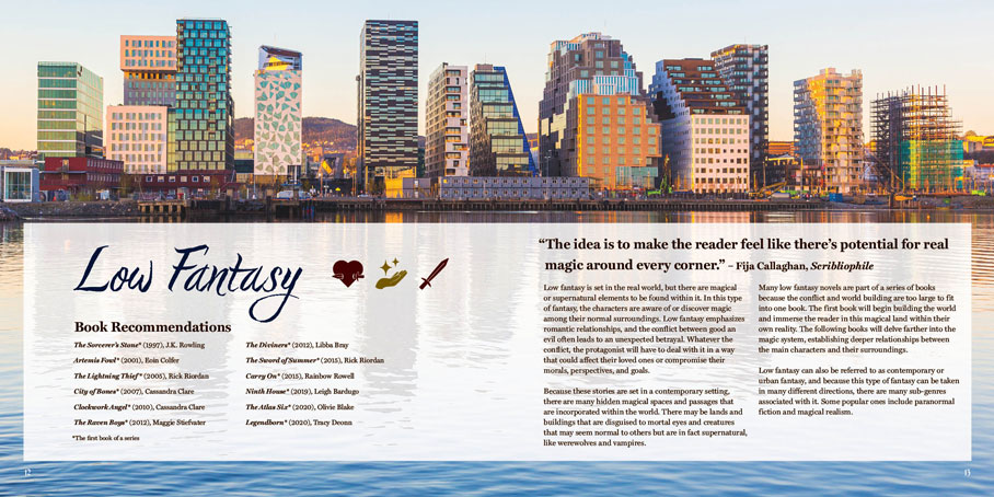
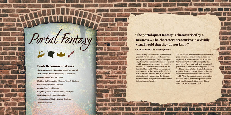
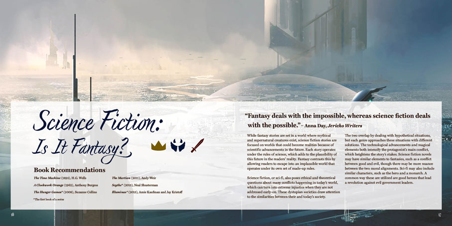
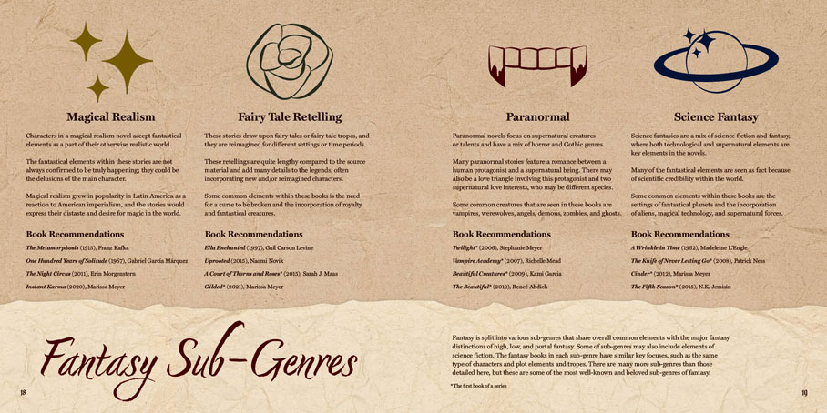
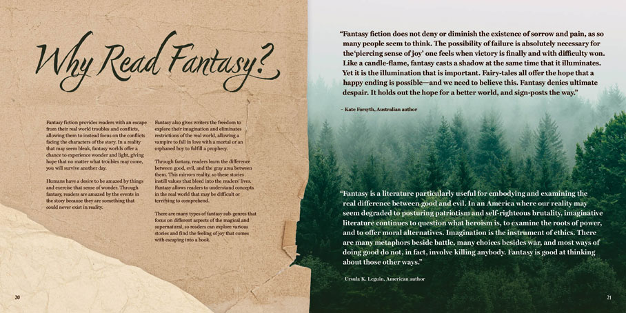
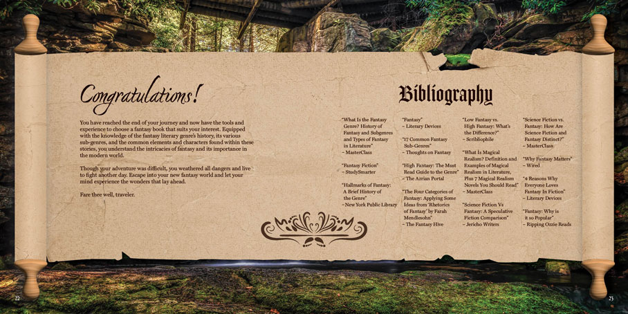
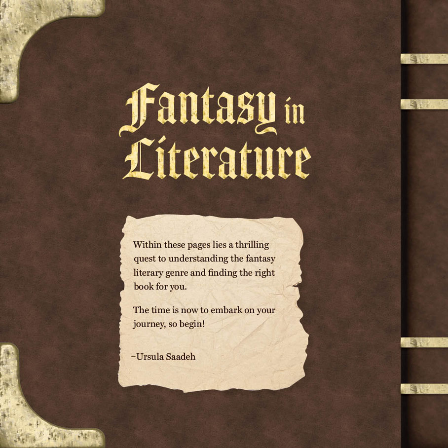
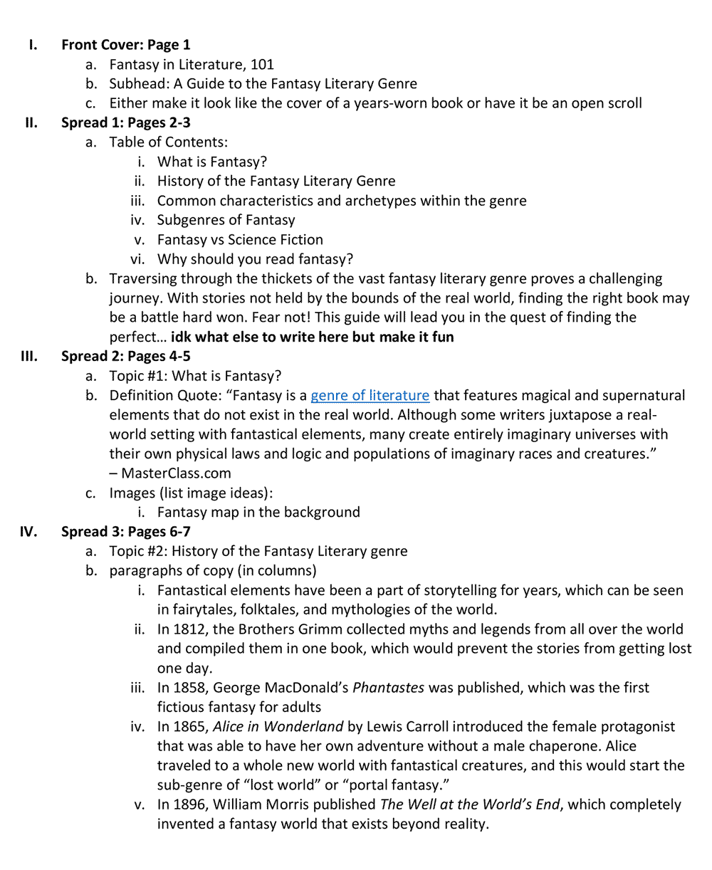
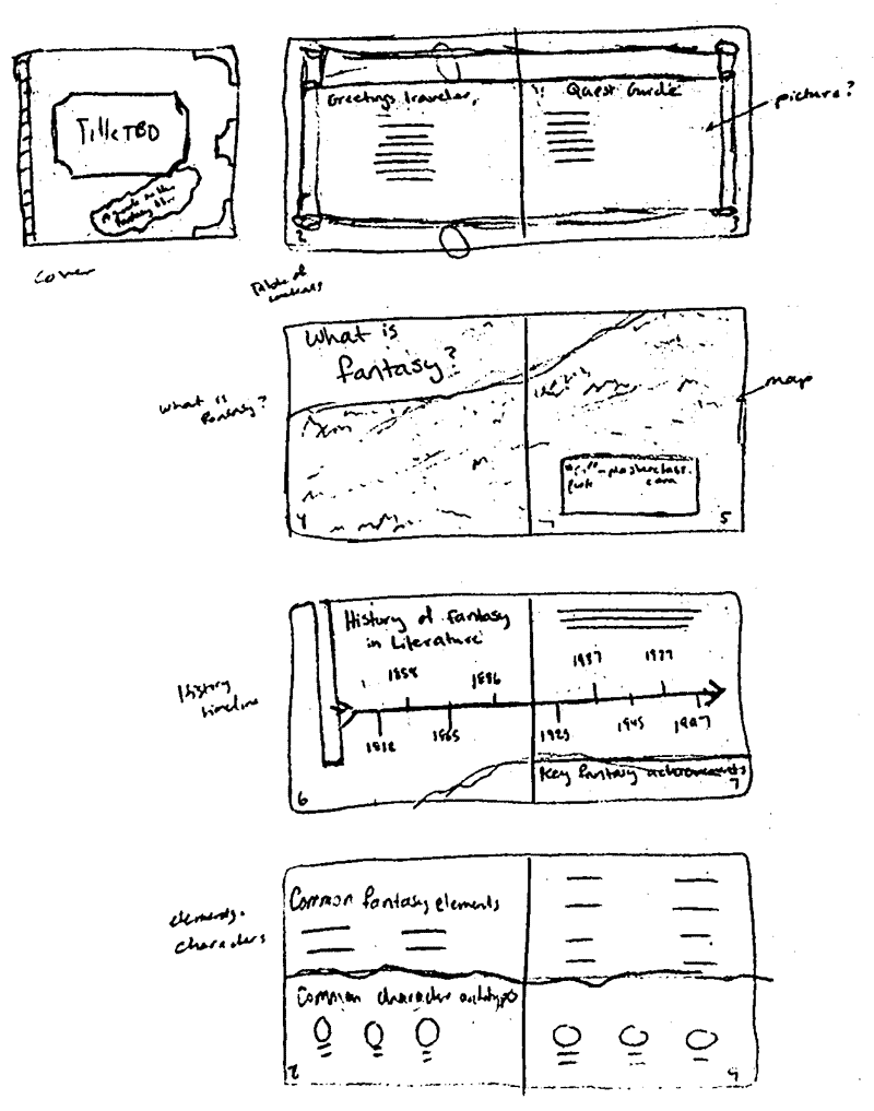
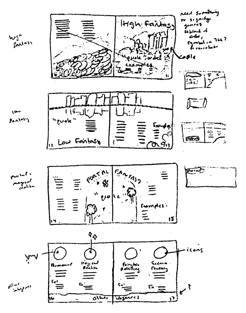
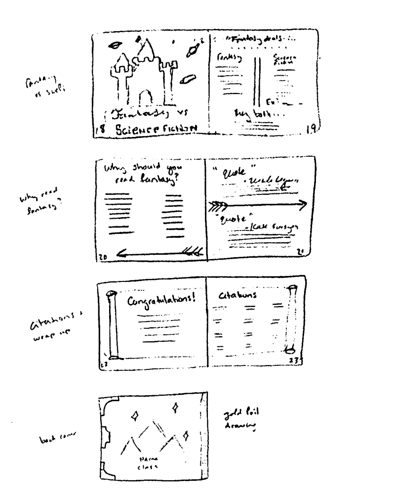
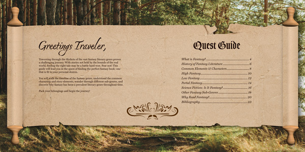
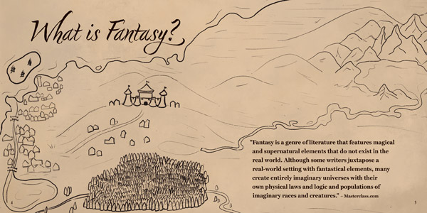
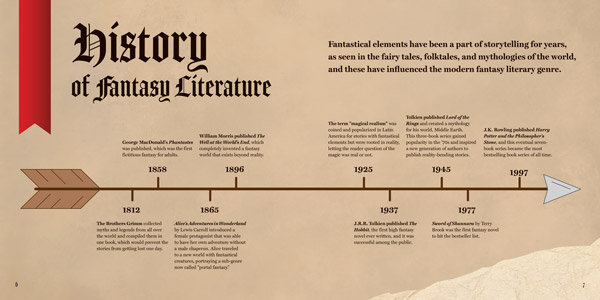
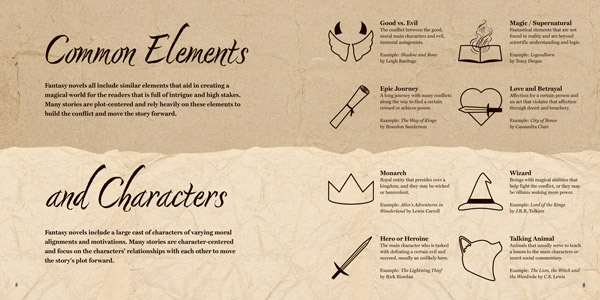
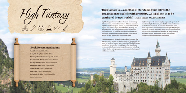
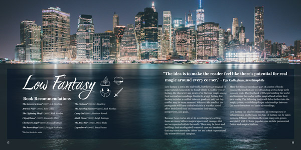
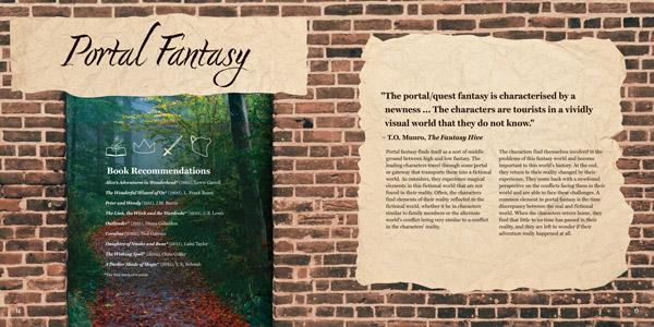
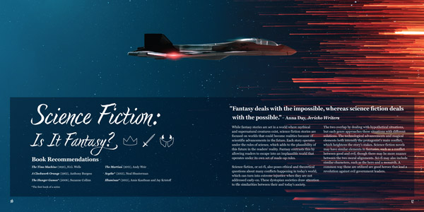
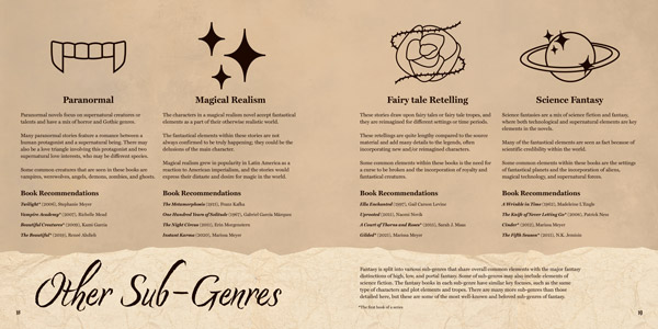
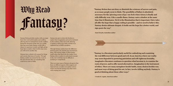
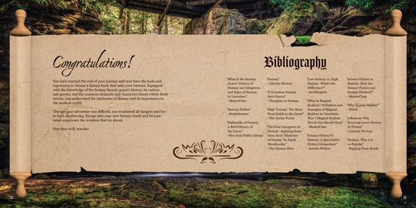
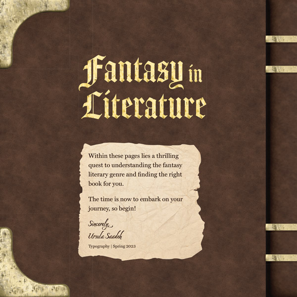
A parchment and ripped paper motif extends throughout the brochure to symbolize found items on a quest. The brochure uses stock imagery from Pexels and Unsplash and illustrations created on Adobe Illustrator and Procreate. All background images on sub‑genre pages depict these books’ typical settings. These pages contain icons pinpointing the sub‑genre’s most common elements and characters.
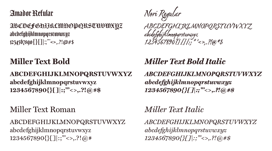
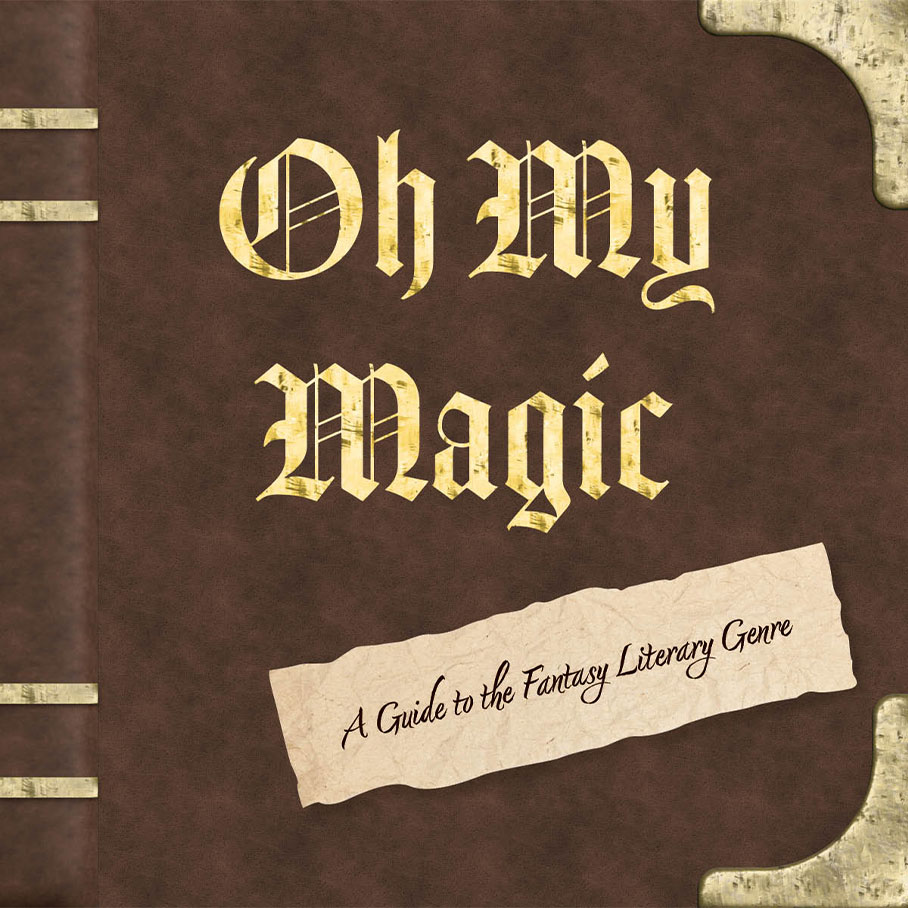
Handwritten section titles draw the reader to learn new information. Blackletter typeface Amador captures the essence of an old, medieval book. Nori, a script typeface with many glyphs, represents handwritten notes that a hero may find on their journey. To contrast these two elaborate fonts, the brochure’s body copy uses Miller Text, a serif typeface that guides the readers’ eyes through the information.
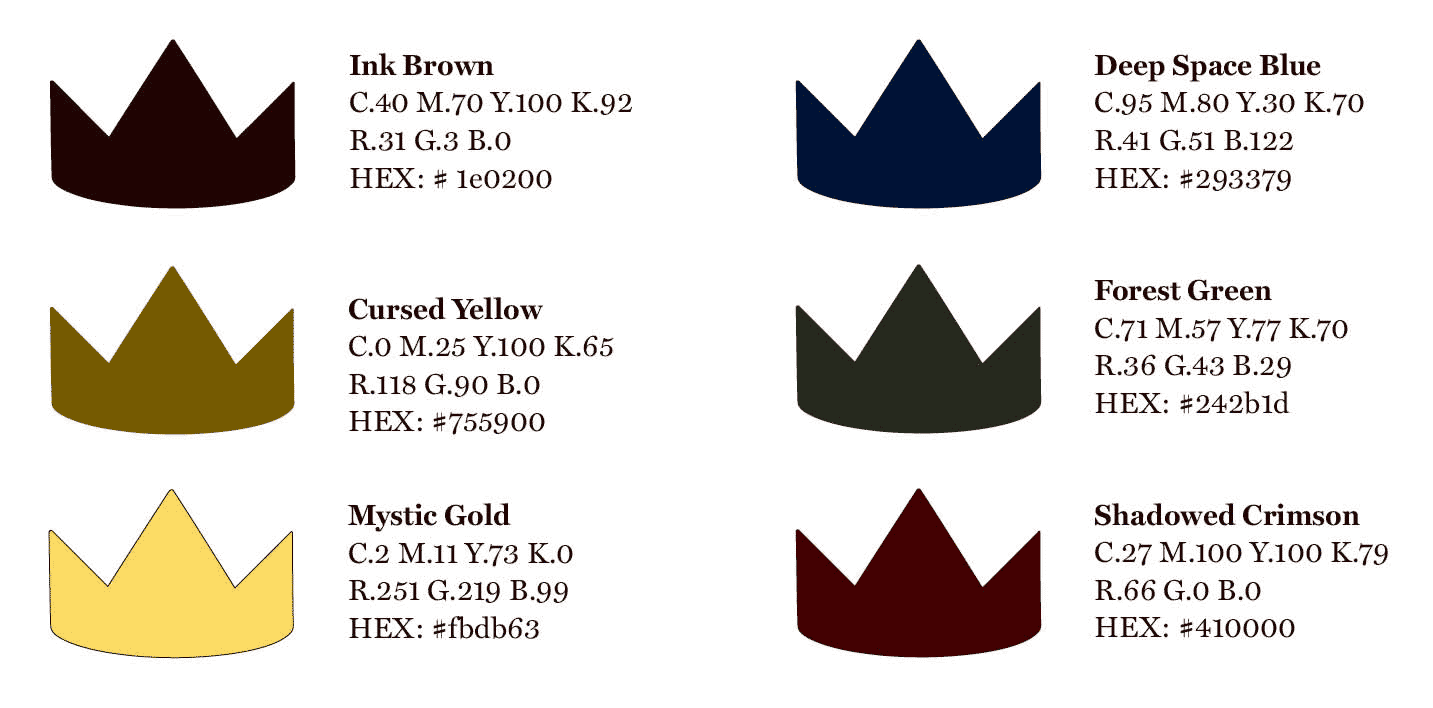
With its quest concept and parchment motif, Oh My Magic’s color palette consists of neutral browns. The rich brown copy reminds viewers of dried ink on parchment, and the supplementary whites, grays, and golds evoke the feeling of opening an old book. These colors build a brochure with information about a literary genre that has stood the test of time and continues to evolve in the modern day.
final brochure
color & type study
